 Request Website Quote

Making table headers bold is one of the simplest but most effective ways to improve the readability and hierarchy of tabular data. A bold header instantly draws the eye, helping users to quickly scan and understand the information below. While the technique is straightforward, a robust approach ensures your tables are not only visually clear but also accessible and maintainable.
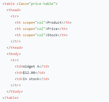
The foundation is clean, semantic HTML. Always use the <th> element for headers instead of styling a regular <td>. This provides inherent meaning for assistive technologies like screen readers. For even greater clarity, include the scope attribute—scope="col" for column headers and scope="row" for row headers.
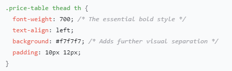
For the CSS, directly target the <th> elements within the <thead> to apply the bold weight. Using font-weight: 700 (or the keyword bold) is standard. This method is preferred over a general th selector as it specifically styles only the header row.
For stronger emphasis, you can experiment with heavier weights like 800 or 900, and add properties like letter-spacing or text-transform: uppercase. However, ensure your chosen web font supports these heavier weights, or the browser may render a poor approximation.
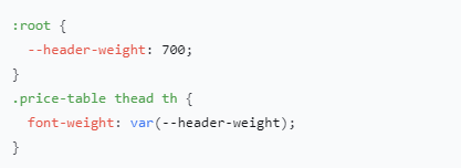
To make your design system more flexible, use CSS variables. This allows for easy theming across an entire project.
Finally, remember that accessibility is paramount. Beyond semantic HTML, always check that there is sufficient color contrast between your header text and its background. Don’t rely on font weight alone to convey importance; combine it with other visual cues like a subtle background color or borders for a truly robust and user-friendly table.